Evaluation of Final Magazine Product
At the start of this project, for the development of the magazine I researched into music magazine conventions. From the website; http://www.ipcmedia.com/ I looked into researching similar products which gave statistics about different magazines and what their target audience was. My main magazine that I wanted to look at, although I looked at more than one type of music magazine was top of the pops. From looking at Top of the pops, the conventions that I found out was that the magazine price that is found on the cover was £2.45 and the most frequent readers were female, the age range that people read the magazine were 11-15 years old. From those conventions that I found out, I have put them onto my magazine for example, based the magazine at girls because this was the main percentage of sex that read the type of magazine and also the age range.
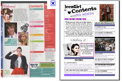
This an image of the magazine product that I intended my magazine to be like, and then my product:
From producing my magazine from basing it from 'Top of The Pops' I made similarities such as using girly colours such as pinks, purples and whites. I used slightly the same cover lines and also used one main cover image on the front page. My magazine focuses on only one certain genre of music (POP).
From looking at all of the magazines that I analysed, I tried to base my own magazine around them. The colours used in the magazines represent the social group that I was aiming for. I also composed a questionnaire for people to fill in which gave me more of an idea what target audience I would be basing my magazine round.
From the results I found that most of the people who took my questionnaire 75% were of girls, this firstly gave me the idea that my magazine would have to have girl like features including colours and types of fonts that girls would attract to. Then from the second question I found that most of the girls who took the questionnaire, were from ages 11-13. From this I could conclude that the words that I would be using in my product would have to be relatively simple and also I would try to use slang words so that the teenage girls reading the magazine found it interesting.
In my production of my magazine, the main technology that I used was camera work. I used many images throughout my magazine and used a digital camera to take the picture on my front cover and also for the pictures through out the contents and double page spread. On the front cover I used a long shot, so that you can clearly see what the whole outfit the girl is wearing and the background around the two girls. The shot goes with all of the cover-lines around the front page and relates to them in some ways.
I took the pictures on a digital camera which made them look clear and also when uploaded onto the computer, they were easy to edit. From editing the light and contrast, it made my photo look more into depth, I also de-noised it to make it look more proffessional and more magazine like. From researching into magazines, I could clearly see that this is what all other magazine producers did too, to make all of these alterations I used iPhoto and an Apple Macbook Pro.


No comments:
Post a Comment