Thursday 5 May 2011

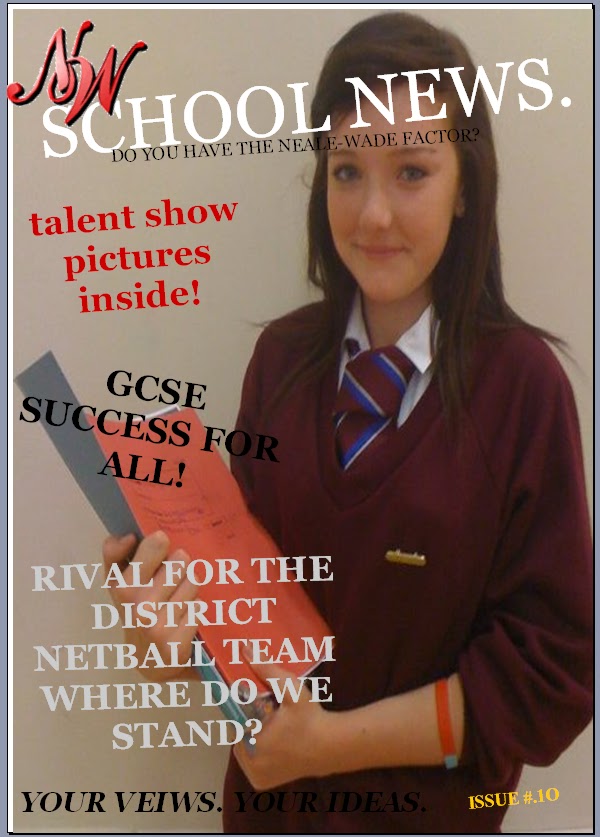
My first creation was my school magazine. I used very basic techniques to create the magazine such as using simple word art from a basic computer word processor. I used just one main image on this magazine and cover lines surrounding it. This gave an easy route for the eye to firstly immediately focus on the picture then the cover lines and masthead after. The background was light for the picture on the front to stand out and for the headline and cover lines and also the masthead to be in bright colours so that it attracted the eye. I used a school logo which would also attract the eye of the consumer.

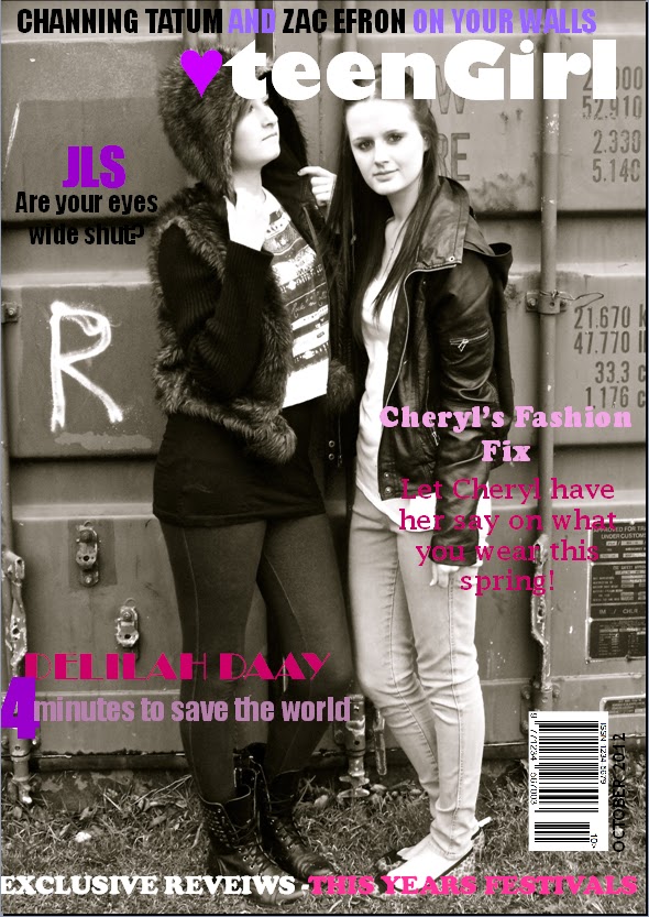
From creating the preliminary task I took some of the basic techniques and made them more complex into my final magazine product, I decided to make them more complexed so that it looked more eye catching and sharper for the consumer. I feel that looking at my final product, I could have been more imaginative on my double page spread because comparing it to the contents it looked plain and simple. From looking at other magazines which related to the genre chose by my target audience, I made my research skills more in detail so that I could easily base my own magazine around it.

I used my preliminary task to show that I had improved my skills into general magazine making and also for the specific target audience, there is contrasts between both of them but major differences in the skills. From completing the preliminary task, I knew what was needed to base a genuine good looking teen music magazine and what areas needed to be stressed throughout the front page, contents and the double page spread. 

Final Evaluation

Evaluation of Final Magazine Product
At the start of this project, for the development of the magazine I researched into music magazine conventions. From the website; http://www.ipcmedia.com/ I looked into researching similar products which gave statistics about different magazines and what their target audience was. My main magazine that I wanted to look at, although I looked at more than one type of music magazine was top of the pops. From looking at Top of the pops, the conventions that I found out was that the magazine price that is found on the cover was £2.45 and the most frequent readers were female, the age range that people read the magazine were 11-15 years old. From those conventions that I found out, I have put them onto my magazine for example, based the magazine at girls because this was the main percentage of sex that read the type of magazine and also the age range.
This an image of the magazine product that I intended my magazine to be like, and then my product:
From producing my magazine from basing it from 'Top of The Pops' I made similarities such as using girly colours such as pinks, purples and whites. I used slightly the same cover lines and also used one main cover image on the front page. My magazine focuses on only one certain genre of music (POP).


From looking at all of the magazines that I analysed, I tried to base my own magazine around them. The colours used in the magazines represent the social group that I was aiming for. I also composed a questionnaire for people to fill in which gave me more of an idea what target audience I would be basing my magazine round.
From the results I found that most of the people who took my questionnaire 75% were of girls, this firstly gave me the idea that my magazine would have to have girl like features including colours and types of fonts that girls would attract to. Then from the second question I found that most of the girls who took the questionnaire, were from ages 11-13. From this I could conclude that the words that I would be using in my product would have to be relatively simple and also I would try to use slang words so that the teenage girls reading the magazine found it interesting.

In my production of my magazine, the main technology that I used was camera work. I used many images throughout my magazine and used a digital camera to take the picture on my front cover and also for the pictures through out the contents and double page spread. On the front cover I used a long shot, so that you can clearly see what the whole outfit the girl is wearing and the background around the two girls. The shot goes with all of the cover-lines around the front page and relates to them in some ways.
I took the pictures on a digital camera which made them look clear and also when uploaded onto the computer, they were easy to edit. From editing the light and contrast, it made my photo look more into depth, I also de-noised it to make it look more proffessional and more magazine like. From researching into magazines, I could clearly see that this is what all other magazine producers did too, to make all of these alterations I used iPhoto and an Apple Macbook Pro.


Wednesday 23 March 2011

Wednesday 12 January 2011

My idea for a music magazine will be teenage/pop themed aimed mainly at girls aged 16-18.

 Its main selling points will be:

·         The front cover, as this will be the first thing the buyer looks at, it will be suited for the age and the gender that it is made for by having a sophisticated and ordered layout. The colour scheme will be brightly coloured so that it will stand out to the buyer. There will also be pictures of celebrities on the front cover that are young so that the audience will know them and be able to recognise them straight away.

·         The articles relate to girls and people who are interested in famous Pop-stars who have current upbeat music out in the charts.
·         I also plan to appeal to this target audience by the things i am including in it, for example I will do this by making the front cover of the magazine the most appealing it could be to draw the audience in and make the target audience buy it. I will do this by arranging it in an ordered and mature way, while keeping the cover-lines about relevant subjects and in places that they will be seen through different routes of address. Its colour and font scheme will also be clear and attractive to make it easy to read and appealing which will be a big out to the audience.
·         The colour scheme that I choose will be the overall theme for the front cover and contents page to keep it simple and then different or additional colours will be used on the double page article spread to make it look more appealing and different to the rest of the magazine.
·         For example the feature of the magazines (interview of artists on front cover) will have a different colour scheme that perhaps relates to that artist in some way as well as the audience which will give the audience an idea and link things.
·         On the contents page and throughout the magazine there will be articles about various famous singers that are in the current charts, interviews with other music stars, a poster section, reviews of artists, singles and albums, tour dates of boy solo singers. The interviews will be of music stars that are young to relate to my young target audience, they will be of both male and females.
·         As my magazine needs to appeal to girls, I will also include recent news about music stars and things that they have been wearing as in my questionnaire the interests on girls included gossip and fashion.
·         The image of the celebrity on my front cover will either be a girl who is fashionable and successful or a boy who is attractive and successful to appeal to the female audience as well as the music side. Or I could have both as also in my questionnaire people said that they like more than just one photo on the front cover.
·         I think that my magazine will be extremely successful as i have made sure that i will include all the things they said they would expect to see in a music magazine and the other answers will let me appeal to my specific target audience well. I also plan to keep it at a reasonable price of £2-£3 so that it is affordable for young teenagers who currently are at school or in higher education, as they cannot afford high costs.

1st Draft of Contents Page

Contents

Wednesday 5 January 2011

Fonts

DRAFT TEXT

Draft Text

Level 4 Criteria.

From looking at past AS students Level 4 Magazines I can identify that they have used many different aspects to achieve their grade.  They have used brightly coloured titles and large bold fonts for them to stand out and the pictures used are relative to the stories. For example, the “Drowned In Sound” pictures have been selected purposely for the mise-en-scene of the magazine and for the mood from what they want the audience to see and feel, the pictures have been manipulated to the context of the magazine by using ICT appropriately to the task they have been set. The lighting they used was bright to go with the mood of the front page. They have also used appropriately integrating illustration and text in all the front page, double page spread and contents page. They have showed understanding of the conventions and layout of all the page designs keeping it all very formal and running the same theme throughout.
From looking at the planning of my magazine, I think that I have the potential to achieve a Level 4 for my proposed magazine if I think particularly about the ideas of my photography and the range of different shot types so that they are not all the same, they all also have to be relevant. I have thought about the mise-en-scene of my photographs for my magazine as taking photos in a background with un-related things to my audience would not appeal and also not look as good as it would, this is why I chose to take all the photographs with a blank background behind. The language that I have planned is relevant because I haven’t used words that the target audience would not understand and have used relative words that they would know and use themselves. My layout will have to follow my conventions and the range of suitable fonts would have to be a wide variety as using the same would be boring and not attract the reader’s attention and would probably not want to read on more.
Draft For Front Cover

Tuesday 30 November 2010

Planning.

From now on untill December 13th I will be planning my magazine, including:
- drafts of layout for each page – front page, double page spread
- samples fonts and colour schemes
- draft of text for article
- production plan

Wednesday 17 November 2010

Create your free online surveys with SurveyMonkey, the world's leading questionnaire tool.

research into a similar magazine using the internet

I looked at a magazine called 'MIZZ' as this was a magazine that was similar to my target audience..

The Mizz website is owned and operated by Panini UK Ltd, a wholly owned subsidiary of Panini S.p.A. and the same web privacy policy applies to the Mizz website as to all other Panini websites. PANINI is committed to protecting any personal information that you may provide to us. See the following for an explanation regarding the Mizz and PANINI web sites, including explanations about what kind of personal data will be collected and stored, for which purposes and with whom it might be shared.

The Panini Group
The Panini sticker and card division is part of an important international group which, in Italy and most major European countries, is composed of 4 divisions. In addition to the sticker and card Division, Panini has a Comic Division, a Comic distribution Division (Pan Distribuzione, where Pan stands for Panini...) and a New Media Division (Panini Interactive, which develops and carries out Internet and multi-media projects).

The Panini Group: History and Background Info
Panini was founded in 1961 with the launch of its first Calciatori/Football Players collection. The founders, the Panini brothers, had already opened a news stand on Corso Duomo in Modena in 1945 and by 1954 had started the Panini Brothers Newspaper Distribution Office.

The company remained under the control of the Panini family and grew to reach an annual turnover in excess of 100 billion lira.

In 1988, the company was sold to the Maxwell Group, which imposed a series of managerial changes through foreign management. After years of financial difficulties, Panini was bought by Bain Gallo Cuneo and De Agostini in 1992. It took only two years of careful administration to return to its past glory. Panini then joined the Marvel Entertainment Group. The management, however, headed by Aldo H. Sallustro, was maintained, and the headquarters remained in Italy.

On October 8th, 1999, Panini was bought by Vittorio Merloni's Fineldo SpA, an Italian conglomerate engaged in the manufacture of various consumer products and financing businesses, together with the Senior Management of Panini.

Recently, Panini has acquired the company World Foot Center, which deals with the distribution and promotion of football merchandising, both for clubs and for the French national team. It has also acquired a major share in DigitalSoccer Project, which develops revolutionary software in the sports sector. Moreover, the manufacturing of adhesive paper, represented by the Adespan division, has been sold to Avery Dennison, the world leader in the adhesive paper market.

The Panini Group, with headquarters in Modena, Italy is the world leader in the collectables and trading cards market. A multinational company and one of the leading children’s magazine and book publishers in both Europe and Latin America, Panini is also a major distributor of third party products in Italy, France and Spain. In addition to this Panini is involved in substantial multi-media programmes. In 2007 the Panini Group turnover was 543 million Euros and the Group spanned a total network covering over 100 countries with more than 700 employees.

Panini makes other products such as:
  • Harry Potter and the Deathly Hallows Part 1 sticker collection
  • I Love Princess

Tuesday 16 November 2010

Research for similar products using the internet

NME MAGAZINE

KEY STATS:
Female26%
Median age:23
Student42%
Circulation:33,875
Readership:325,000ABCe
Unique Users: 5,342,246

•Readers have a strong relationship with NME and completely trust the brand:-
"I can trust it"
-"Its full of facts that we should all know but don’t BUT we do now thanks to NME"
-"Honest no-holds barred reviews".

MUSIC


Not surprisingly NME readers arecompletely obsessed by music.Reader research has demonstratedthat they rely on the editorial and theads to keep them up to datewith new music. This knowledge thenmakes them the authority in music intheir peer group.
Male:74%
In todays lesson I created a survey to identify what my target audience is by asking relavent questions. Once people have completed my questionnaire I will then produce a summary with the results explaining the key things I found out about my own target audience and how the audience research will help me to produce a successful product.

Friday 12 November 2010

Evaluation of Research and Planning.

From looking at different types of music magazines from the internet and also from what shops are actually selling I have realised that there are many different music magazines which have been made for different target audiences.

All of the magazines have similarities for example, having front cover page and contents themes which run throughout using the same colour themes and also the stories. Although I found these similarities, there are many different comparisons that can be made which are all very clear. For example, looking at magazines made for the younger generation use different brightly coloured themes to attract the visual eye so that the consumer picks up the magazine and thinks to themselves that it looks fun and interestting to read whereas, the music magazines that have been made for the older generation have thought about using pictures that tell the story and make you think not just by using brightly coloured themes and also the writing is much more formal which an adult would be more inclined to read because they would think that it is more suitable for themselves.

From researching I can now conclude that I will be making a magazine for the younger generation such as 'Top of the Pops' music magazine because it seemed to have much more of a fun factor than the other magazines I analysed, the magazine still uses the same text but I feel that because these magazines are made for people who are younger than my generation age, I would be able to create one by using knowledge that I already have as I was once the age that the magazines were consumed for and therefore would know more about teenage dramas and issues whereas making a music magazine for an older adult I would not know and would have to find out more. I also have more knowledge on the type of music magazine for example, the pop music is very common and I listen to it regularly whereas I would not see myself listening to classical music.

Wednesday 10 November 2010

From just analysing two different types of music magazines in this lesson, I have noticed a major difference between the differences that are made for target audiences. From looking at the Top of the Pops magazine then looking at Vibe magazine a lot of different technical aspects are used to catch the audiences eye. For example, brightly colours are used for the younger generation whereas for the older generation colours are not so much a thing to attract the audience whereas the pictures give you mental images and describe the magazines. Next lesson I will compare a music magazine which is targeted for older people to see how it is different.
In todays lesson I will look at contents pages and a two page spread story from different types of music magazines.

Tuesday 9 November 2010

Today I have looked on the internet for more formal music magazines and compared it against the others i have annotated, there were many differences compared to the pop music and Hip Hop magazine, it was more formal and the mode of address was aimed for the older generation and for people who like reading about classical music.

Tuesday 2 November 2010

2nd November 2O1O

This lesson I will look at different types of music magazine front covers to identify similarities and differences between them all.